Email Layout: HTML as Text
A common question from trainers, consultants, and professional coaches is the best way to set up their HTML email. Should it be a fully designed email or ultra-simple with just text? While each campaign likely calls for its own solution the answer is usually either, just don’t split the middle.
Its odd advice as a happy middle ground is often ideal. In this case, it’s better to pick an extreme and go with it. One extreme is a fully designed email that would include some kind of recognizable header, defined styles, font uniformity, selective image use, and defined footer. This appeals to visuals and ,if usability standards are maintained, will deliver the critical content via text.
The polar opposite is an HTML layout made almost exclusively from text. Some simple image use, font consistency, and a defined footer is likely advisable but everything else should be stripped down. This provides a clean to-the-point email that brings the content right to the forefront.
Trainers, Consultants, and Professional Coaches often get into trouble when they refuse to make a decision on the style or don’t have the technical capabilities to pull off a well-designed HTML email. Often times this will be a basic html template with ancillary images and unnecessary content.
The problem with this approach is that it arbitrarily adds items that distract from the content. Furthermore it often causes poor usability standards. I’ll describe such a case I recently received from a consultant.
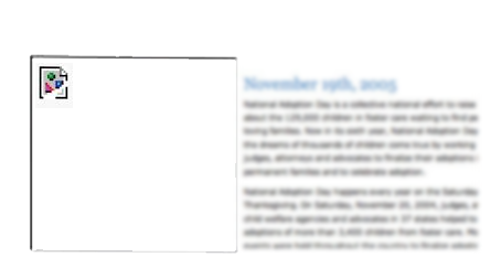
As illustrated from the screen shots below (text and images blurred for anonymity) when I previewed the email the only thing I saw in the screen was a blocked image square (my emails block images by default unless I enable them) and some text. The headline did not appear as the background color did not display on my screen so the white text was invisible. This is especially bad because the link to get more information in the header was invisible. Worse yet, had I viewed it on a mobile device the email would have appeared blank unless I scrolled left or right.
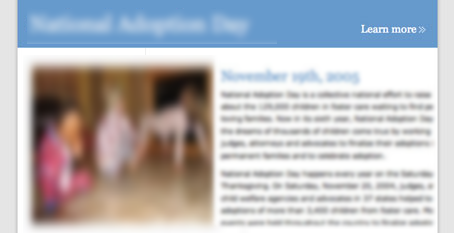
The second image is from the view as a webpage version and shows what the sender intended the email to look like in a preview. If a layout is very simple then strip it down to highlight the text. If the image was moved to the right and made smaller and the blue band wasn’t there would it greatly impact the look of the email? Probably not and at least it would put the content right at users fingertips.
Beware of templates or layout decisions that are made due to technical limitations or because it “looks good”. If a defined professional html template is not practical, often times a text dominant email is most appropriate.